
Case Study: Path Resorts
We recently had the opportunity to create the logo and some of the print collateral for Path Resorts – the new “parent” brand for Steele Hill Resorts, Summit Resort and Center Harbor Inn – serving as the “Gateway to New Hampshire’s Lakes Region”. Our challenge was to communicate the new brand without departing from the look and feel of the three resorts within it. The logo needed to be timeless, with an air of New Hampshire charm, that could easily be communicated and a variety of different methods and channels.
The Solution

Elegant & Timeless
The logo we created is easily reminiscent of the Steele Hill Resorts branding featuring Trajan for the brand font. The graphic element we conceived that accompanies the brand name combines elements from the Steele Hill logo with an earthy rust gradient and a winding road leading between the tree elements. The road is symbolic of the Path Resorts tagline, Choose the Road Less Traveled, which illustrates the concept of Path Resorts, which is based on the poet Robert Frost’s famous poem, The Road Not Taken.
Initial Concepts
Our initial concepts included a variety of different approaches to the logo, however, all reminiscent of the Steele Hill Resorts brand, so as not to depart from the brand’s recognition. They decided on an earth tone for the brand’s accent color, which was built into each of the concepts. We began with four simple concepts, based on their preferences, things that they liked and had the most practical usage. Of the initial designs, they chose one (featured in the lower right above).
From there, they requested some color variations and moving the circular element down and in front of the Path Resorts text, as seen below.
![]()
Ulimately, they settled on a gradient of color for the circle “path” element consisting of a light to dark mixture of the colors above, with the darker color being applied to the “Resorts” text within the logo. To give the logo a bit more dimension, a slight drop shadow was applied to the entire logo.
Logo Variations
In addition to the main Path Resorts logo, they requested variations of the logo to be created featuring the various aspects of the Path Brand – Path Hotels, Path Hospitality and of course, Path Resorts.
Print Collateral
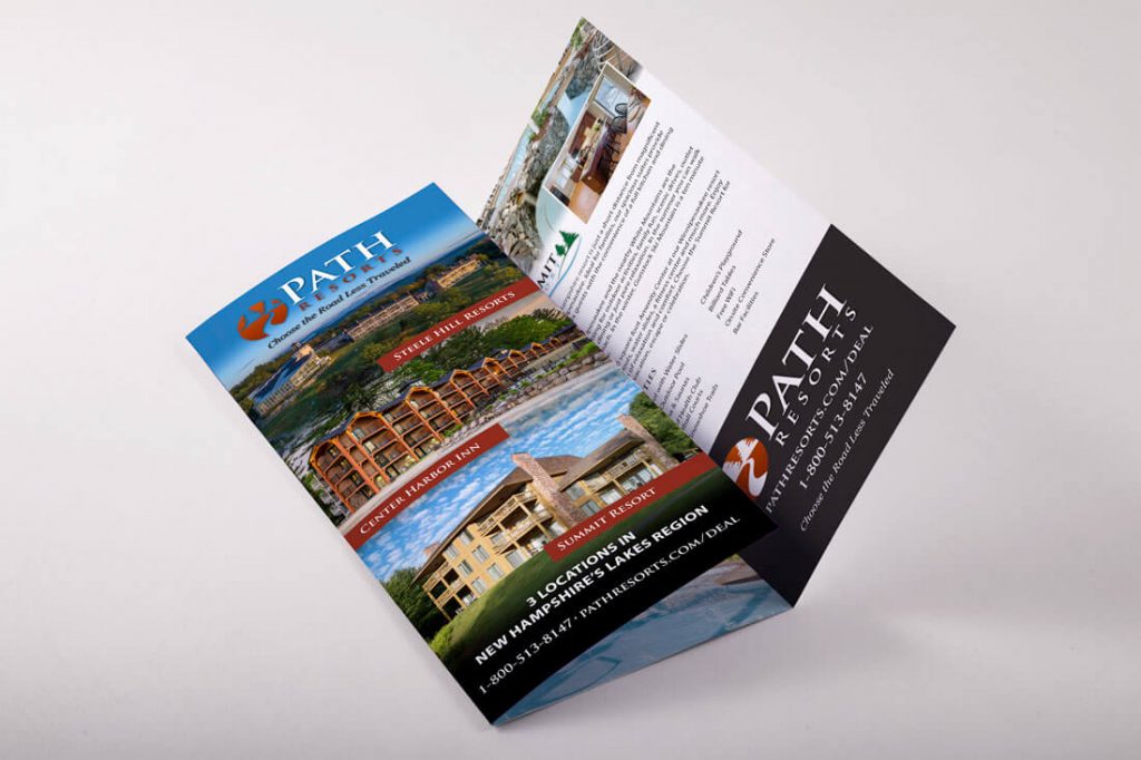
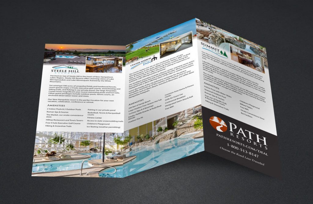
After the logo was finalized, we began creating print collateral to promote the new Path Resorts brand using print collateral. We first started with a rack card trifold brochure encompassing all three resorts while promoting the new brand. Taking content from their already in-use rack cards for Steele Hill Resorts, Summit Resorts and Center Harbor Inn, the brochure features all of the amenities, information and details about each resort. The cover of the brochure neatly displays the three resorts under the umbrella of the Path brand.
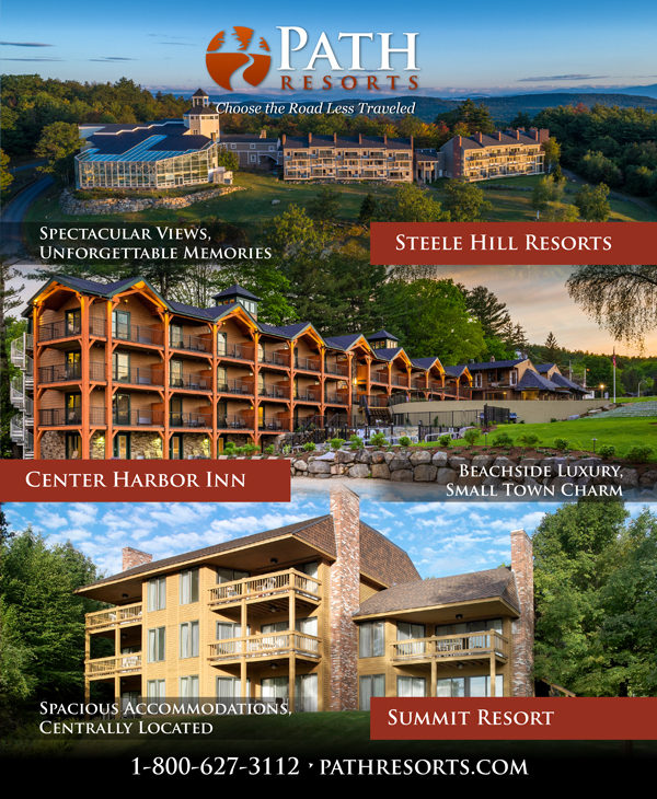
From there, some newspaper and magazine publication advertisements were created, mimicking the front of the trifold brochure. The ads highlight the new brand, in general, while display locations under the Path Resorts brand. Each location has its unique logo and tagline, yet connected through style, color and design elements.
The overall look and feel of the new brand is clean and concise; using carefully chosen imagery to drive the design and connect with the viewer.
Justin Cutillo,Vice President of Path Resorts, had this to say about us and the project: “Jeff has been a solid, dependable vendor of creative services to our hotel group for years. We recently created a new parent brand for the hotels. Jeff was instrumental in developing the look and feel of key elements including our logo design and print presence. His strengths are in his creative delivery, flexibility and ability to translate direction and feedback into an exceptional final product.”
This has been a fun project to work on and we are honored to have Path Resorts and their organizations that fall under their brand to give us the opportunity to create their new Path Resorts identity. As Path Resorts continues to grow and expand, we hope to provide more of their creative for their marketing efforts.
Like what you see?
Contact us today to help you get started on your new brand identity!


