
How to Design for Conversion: Essential Elements
Everyone wants their design and marketing to convert potential clients into customers. And, just like designing anything, be it a website, an ad, a social media advertisement, you want it to do its job getting people to reach out and contact you. However, in any of the examples just listed, the design is a huge part of the success of the piece. It’s important, therefore, to design for conversion and not just to put the information out, hoping someone will click, call or submit your form.
How does one “design for conversion”?
To design for conversion, you have to, as Stephen Covey said as one of if habits of successful people, you need to “begin with the end in mind”. That is, you need to think about what you ultimately want someone to do as an action when they see your design. It doesn’t matter whether its entering a drawing, completing a form, or clicking an ad to learn more – your design needs to be explicitly clear when communicating to strangers, which leads me to my first point.
An attractive, catchy headline
Without an attractive, catchy headline, you’re not likely to get the attention of your intended audience. When you design for conversion, you need to use a headline that has a simple meaning and gets to the point. Longer headlines may take longer for someone to process mentally, and since you’re likely to only get 8 seconds of your audience’s attention, it’s best to make it succinct but clear. Another way to make sure you reach your target audience is to use their language – not like french or spanish (though if your audience speaks either of those languages, you might consider it), I’m talking about words that are part of your audience’s daily vocabulary. In other words, don’t use a $10 word when a $5 word will suffice.
For instance, here’s a poster concept that was done for a promotion for Steele Hill Resorts held at a Whale’s Tale Waterpark:
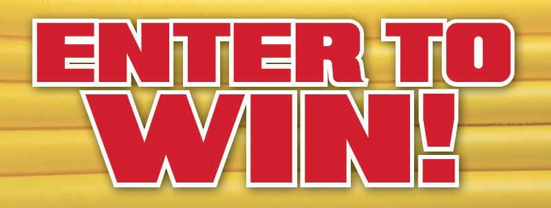
Notice how the message is clear “Enter to Win!” and it’s bright, attactive noticeable. Sometimes your headline, like this one, can be your call-to-action. It’s important to have the headline be clear and catchy because otherwise, if you leave it open to interpretation, people can be turned off or worse, misunderstand your intentions.
Appropriate imagery and graphics
Have you ever seen an ad, poster or flyer that has the sad looking Microsoft Office clipart from the late 90’s? Kind of a turn off, right? To design for conversion, you really need to use appropriate, quality imagery and graphics to help drive your headline. What do I mean by appropriate? Well, think about it this way. If you’re advertising for a funeral home, clip art and line art graphics aren’t really going to communicate to your audience that you’re trustworthy and professional. Using carefully chosen images that communicate professionalism in your field help generate trust and demonstrate that you care enough about your appearance to use appropriate images. Yes, they cost more. Yes, it takes more time to find those images. But, it will payoff in loyal recurring customers.
Let’s talk about quality graphics and images for a minute. There’s really nothing worse than using a picture that is sized at 30×30 at 72 dpi for a logo that goes on a poster that’s 24″ x 36″. That is not quality. The same can be said of using images off a cell phone – granted, many of the newer smart phones have DSLR quality cameras in them, but still. Make sure your imagery and graphics is big enough for the purpose it’s being used for. For example, if you’ve got that 24″ x 36″ poster, make sure that the images are no less than 300 dpi and any logos are vector images. Vector images are images that have been created in programs like Adobe Illustrator and can be blown up to any size without any degradation of quality.
Why is this important? Well, how likely are you to be a customer of someone who can’t take the time to put a little money and effort into their marketing by using quality graphics and images? Not very. Let’s face it – perception is reality – if you look professional, people – customers – will see that and be more likely to buy your products and services.
A clear offer, deal or prize
Ok, so now we get to the meat and potatoes of the design – this is where you need to be explicitly clear about what happens when someone converts on your call-to-action – what do they get? Most of the time, when you design for conversion, it’s an offer or a deal – something you’re trying to sell or get them to sign up for. It’s extremely important to be very clear about two things: what they get from you and how they get it. Let’s start with what they get. Your offer needs to be something your target market wants – or needs. Without that, they just won’t convert. It needs to be a clear offer – that is, don’t leave anything open for interpretation because it could go bad if they thought you were offering one thing, when in fact, you were offering something else. Be clear and upfront. Sometimes contests can be a bit ambiguous as far as what the prize is, and how you claim the prize.
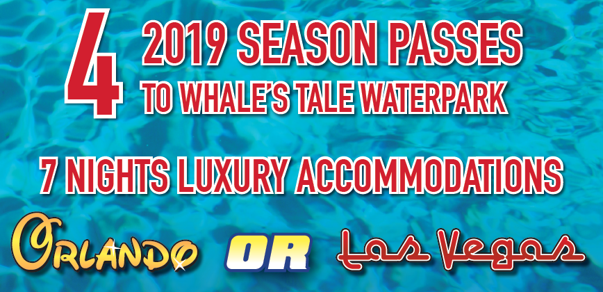
Next, be clear about how they claim the offer – is it a coupon? Is it an emailed code? That info should be displayed prominently (or at least legibly) in your advertisement, poster or sign. Additionally, there’s a couple rules of thumb for getting people to “sign up” or “enter to win” that should be followed. First, make your offer, deal or prize as low barrier as possible. By low barrier, make it so that they don’t have to pay anything to enter or sign up and that they only need to give up minimal personal information (name, email, etc.). Most of the time, that’s what you’re looking for anyway, so keep it simple. People are more likely (especially new customers) to convert on a low-barrier offer than they are on a much higher barrier offer, at least initially.
Additionally, if you find that your offer is maybe a little “too good to be true”, add some testimonials or social proof to show that people actually love your product or service, have won your contest before, etc.
A call-to-action
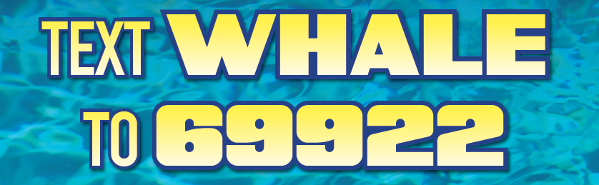
I mentioned this briefly before, however, but now we can get into more detail. A call-to-action is simply that: a call (direction) to action (to do something). “Enter to Win!” is a call to action. “Click here” is a call to action. “Learn more”, “Download PDF”, “Buy Tickets” – all calls to action. The important thing, and this is especially true of website design, is to have several calls to action throughout your site. Typically, a call-to-action will lead to one particular conversion point, however, it’s possible to have multiple conversion points – just don’t confuse the user by having too many. Without a call-to-action, your design could be overlooked. If it’s not clear what you want the user to do, the user could leave without converting.
As an aside, I highly recommend that if you are attempting to sell anything online, that you use a landing page. See our post on landing pages here. Beyond that though, these elements that I’ve shared can also be applied to a landing page, however, with one small change – all calls-to-action need to lead to the same conversion point.
Your contact information
This seems pretty no-brainer, however, it can get forgotten in and amongst all the other elements mentioned above. Make sure your contact information is in the design and that it’s correct – phone numbers, emails, websites – and make sure that if you publish it as a contact method that someone is truly on the other end ready to receive messages, answer phones, etc. Only publish the methods that you want people to contact you through – for instance, it’s great to publish that you’re on Facebook, but don’t publish that as a method of contact if you aren’t checking it regularly.
When you design for conversion, you’re beginning with the end in mind – ultimately what you want from someone who sees your poster, advertisement, webpage, etc. Clarity, among all else is key. Take the time to choose your graphics and imagery wisely and spend a little money on it if you see fit to do so. Look at your design from the perspective of your ideal customer – would you sign up for your offer? Is your offer low-barrier enough to get it to convert? Can people contact you if they have questions? If you design for conversion with these essential elements in mind, your ad, design piece or promotion will definitely convert potential clients into paying customers.
Did I miss any “essential elements”? What design elements work best for you?


